How to optimise your store layout
Maximising space efficiency in your store isn’t just about making things fit, it’s about creating a shopping experience that feels intuitive and comfortable for customers. Did you know that strategic layout changes can improve sales by 20-40%? Whether it’s the layout of your floor plan, the strategic placement of products, or the setup of your point-of-sale (POS) space, optimising the layout and how you use your space will directly affect your sales and customer satisfaction.
Understand your retail portfolio
Store life cycle management for retailers and retail property managers

Choose the right floor plan
Your store’s floor plan can significantly impact how customers navigate and interact with your products. Choosing the right layout helps guide customers through your store, making it easy for them to find what they need while subtly encouraging them to explore more. There are several floor plans for retail that you can choose from, including grid, loop, diagonal, and forced-path layouts.
- Grid layout: Great for large retailers like Walmart. This layout organises products in straight aisles and helps customers easily navigate and find what they need.
- Loop layout: Common in smaller stores. Customers are guided through a loop that exposes them to all product categories, encouraging more exploration.
- Diagonal layout: Improves product visibility and works well in tech or beauty stores. It creates a dynamic flow that directs customers toward featured products.
- Forced-path layout: Most famously used by Ikea, this design forces customers to follow a specific path through the store, ensuring maximum exposure to all products.
What are the best floor plans for retail?
Choosing the right floor plan depends on your store’s needs and your customers’ behaviour. Retailers like Apple use open, minimalistic layouts to invite interaction with their products. Meanwhile, grocery stores often stick to grids, making it easier for customers to locate essentials quickly.
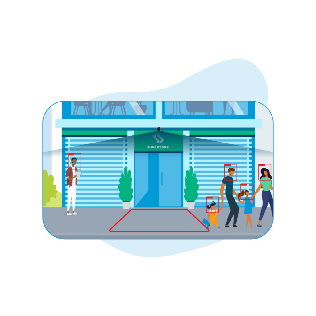
Monitoring dwell and movement using footfall analytics allows you to identify underperforming areas and high-traffic spots. This can be especially useful for expanding retailers who want to trial this technology across stores to benchmark performance for future outlets. MRI Software’s solutions, such as footfall analytics and retail analytics solutions, empower retailers to make data-driven decisions about store layouts, product placement, and customer behaviour.
Place product strategically
How you place products in your store can make a huge difference to your sales. We’ve all been in stores where seasonal or high-margin items are front and center, grabbing our attention as soon as we walk in. That’s no accident! Strategic product placement encourages customers to pick up items they might not have planned to buy.
Consider these tactics for effective product placement:
- New and seasonal products: Place them near the front entrance to catch the customer’s eye and increase the likelihood of impulse purchases.
- Bestsellers: These should be in the middle or back of the store, ensuring customers pass other products before reaching them.
- Clearance items: Usually best placed in the back of the store or in designated sale areas. In larger stores like Target, clearance items are often scattered throughout, subtly encouraging more browsing.
Retailers looking to optimise layout should focus on identifying high-traffic areas and positioning their best-selling products accordingly. A great example of this is Marks & Spencer’s flagship stores, where sensory elements like sight, touch, and even smell are used to create an immersive shopping experience. By positioning displays that engage multiple senses, they encourage customers to linger, explore, and ultimately purchase more.
Retailers can learn from this by thinking about how they can engage all the senses to improve both product placement and customer experience. By moving low-selling items into popular spots, you can maximise your retail space’s profitability and ensure that no area is underutilised. You can also streamline your processes by using capture rate analysis to help determine which products should be placed closer to loading areas!
Consider customer behaviour
Understanding your customers’ behavior is key to optimising your store layout. People tend to look to the right when they first enter a store, which is why many retailers place their most attractive displays or new products on the right side of the entrance. Similarly, studies show that customers tend to shop in a counterclockwise direction, so designing your layout to guide them in this pattern can be highly effective.
Beyond movement patterns, think about your customers’ comfort. For example, after the COVID-19 pandemic, personal space became a greater priority for shoppers. This means wider aisles, well-spaced seating areas, and clutter-free pathways are more important than ever.
Here are a few considerations to improve the customer experience:
- Temperature: Make sure your store isn’t too hot or cold, as this can drive customers away.
- Noise level: Playing music at a reasonable volume enhances the shopping atmosphere without becoming a distraction.
- Seating: If appropriate, providing comfortable seating areas, especially in places like bridal boutiques or children’s stores, can make a big difference in how long customers stay.
By using retail analytics solutions, you can track how customers move through your store and where they tend to linger. This allows you to make data-driven adjustments that improve their experience.
Optimise your POS space
Your point-of-sale (POS) area isn’t just where customers check out, it’s a prime space for additional sales. Most retailers place their checkout area near the entrance or exit, depending on the layout. To optimise layout near your POS, ensure that customers have a clear, clutter-free path that also encourages last-minute impulse buys as they make their way to the checkout.
TK Maxx, for example, has shoppers walk through a loop that ends at the checkout, a tactic that encourages impulse buying of smaller items like accessories or snacks. By strategically using your POS space, you can boost sales without overwhelming your customers. Think of it as the last opportunity to make an impression before they leave.
Here are a few tips for optimising your POS area:
- Impulse buys: Place small, inexpensive items like snacks, accessories, or travel-sized products near the checkout to encourage last-minute purchases. Stores like Sephora and Forever 21 do this effectively by offering beauty products and accessories in their checkout lines.
- Efficiency: Ensure the POS area is clean and free of clutter to maintain a smooth flow. Avoid overcrowding the space with too many products, as this can overwhelm customers.
- Accessibility: In smaller shops, placing the POS near the entrance allows staff to manage both checkout and customer service efficiently.
FAQs
Contact MRI Software
If you want to find out more about our innovative real estate software solutions, contact us today.
The Ultimate Guide on Leasing Software for Your Retail Business
The retail industry is an ever-evolving landscape, with new challenges emerging every day. One of the most critical aspects of retail operations is leasing, which involves managing large amounts of property and lease data, tracking important lease-re…
